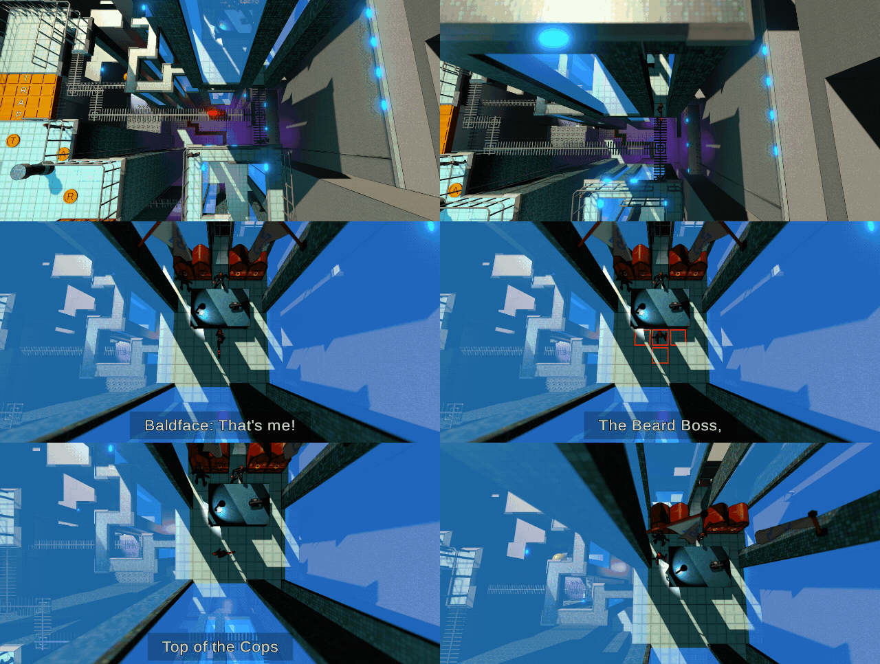
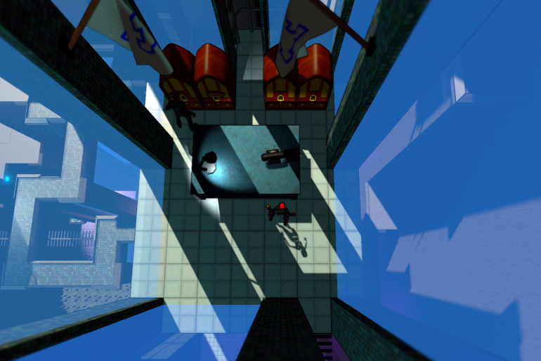
Ian Zimmerman sent me some new models yesterday, and I quickly put them inside my level. I was excited to see how they looked.
He gave me just what I asked for:
- One simple, metal desk. The kind you might find in a World War II military office.
- A fancy old radio.
- A wall-mounted flagpole that I could easily change the texture on.
And he threw in a lamp and a telephone since he was in a generous mood. I think it all turned out pretty well.
This is about the maximum amount of cosmetic detail I want to add to a location in the game. The art style is pretty sparse for two reasons:
- My budget is very small. I can’t afford to decorate every corner of the world to standards like Obduction or even, The Witness, which has a beautiful, but spartan, style.
- My game relies on a limited visual vocabulary to allow the player to make sense of it.
Limiting Visual Vocabulary
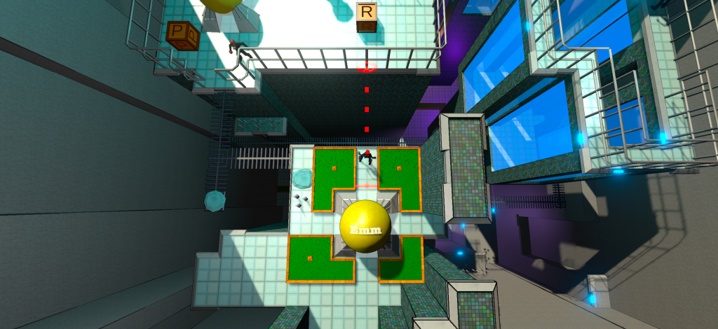
The second point needs elaboration. Below is an image from just a bit earlier in the level before entering Baldface’s office. (Click for detailed view)
As a newcomer to the game, you won’t understand everything you see in the shot above. But since this level is about two-thirds through the game, a player will have been gradually introduced to game elements leading up to it. And they would recognize these learned game elements:
- Emm – the player-controlled character in the center of the screen.
- Eggs – a spawn point. There’s one near Emm and one across the gap.
- Spikes – they kill you. There is one set of spikes near Emm. But you can spot some far below as well.
- Ice – you slip on it.
- Blocks – you push them, sometimes spelling words that close bridges.
- Beards – This enemy leaves you alone until you step on…
- Grass – the green squares that are against the law to step on, but you do it anyway.
- Rails – basic “wall” obstacles, with a few wrinkles.
- Grates – floor squares that you can walk over and see through.
Now, I could redo this screen to have a lot of lovely, special-cased artwork. The grass could look like a picturesque garden with flowers and pebbles. The ice could have more variety and not take up a full square. The rails could be pieces of rusty metal patched together in interesting ways. The floor tiles could lose the grid pattern and be replaced with some nifty industrial, brushed-steel that catches the glint of hanging overhead lights.
But then you’d have more trouble making sense of the eight game elements described above. And your power to see and use a lot of information to solve puzzles is what makes The Godkiller fun.
You’ve played Minecraft, right? You know when you see a block of coal ore far across a football-field-length canyon? It’s just a little black speck. But you recognize it because of a limited visual vocabulary. You saw many similar patterns earlier, and there’s consistency to how things are depicted in the game, so you can be confident in identifying something using maybe 64 pixels.
Baldface’s Office
So for Baldface’s office, we pretty it up a bit, but not too much. (E.g. There’s no chair behind his desk.) And we keep those cosmetic elements away from the puzzles in the game. I think it works.

I really do want to put some moldings on those windows though. I’ll get to it.
There’s a demo of this level in the video below if you want to see how those game elements work.
So, to recap, there is a good reason, other than cheapness, to keep the art for objects in some games simpler and more consistent. It helps the player understand more complicated things.
| The Godkiller – Chapter 1 is a 3D puzzle-solving adventure game available for Windows and Mac on Steam! |


